Redesigning the Essential Guide to Japanese PR
Dentsu Public Relations
A design to reach target audiences with impact
- Graphic Design
Dentsu Public Relations (DPR), Is one of Japan’s biggest, and oldest PR agencies and regularly works with Eat on a range of projects.
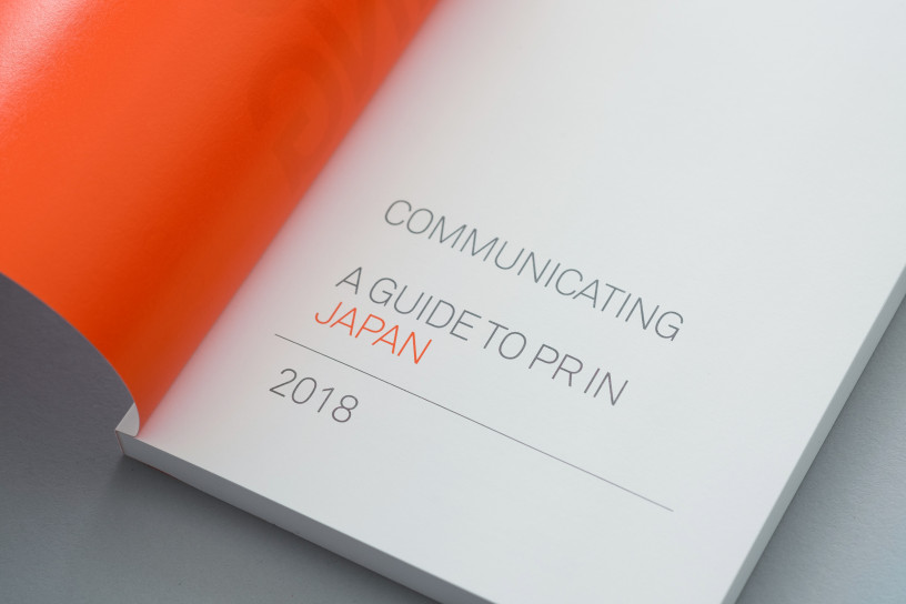
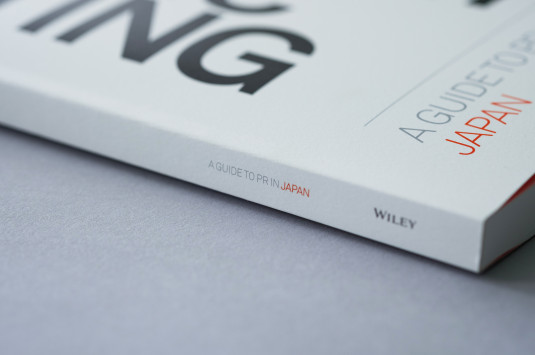
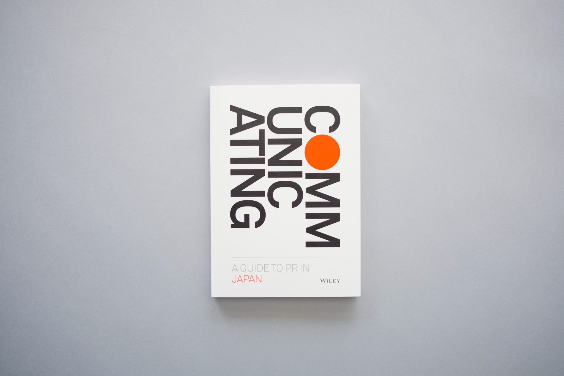
For foreign companies entering a new market it is very important to understand the customs and social norms in order to be successful. Japan can be especially challenging and this has led DPR to publish a guide to Public Relations in Japan, specifically targeting the PR managers of their global clients. Published since 1988 this 112 page book provides an in-depth knowledge of Japanese culture and advice on how to deliver a message successfully to the Japanese market.
For the 7th and 8th edition of the publication, DPR asked Eat to redesign the book and create an identity that would better engage with its target audience
The big bold typography on the cover divides the word COMM-UNIC-ATING into three reflecting Japan’s very different approach to communication. The use of matte and uncoated paper stock, sans serif font and white space with limited use of red and silver accents, conveys a Japanese design aesthetic – both visually and to the touch. A simple layout makes it easy to read. Keeping the font variations and sizes to a minimum, using equal word spacing and simplifying the graphic elements, enables the hierarchy of the content to be clearly visible and a large amount of information easily accessible.