Refreshing a Storied Brand
The Repulse Bay
Setting the standard for luxury and sophistication
- Brand Management
- Brand Experience
- Visual Identity
- Graphic Design
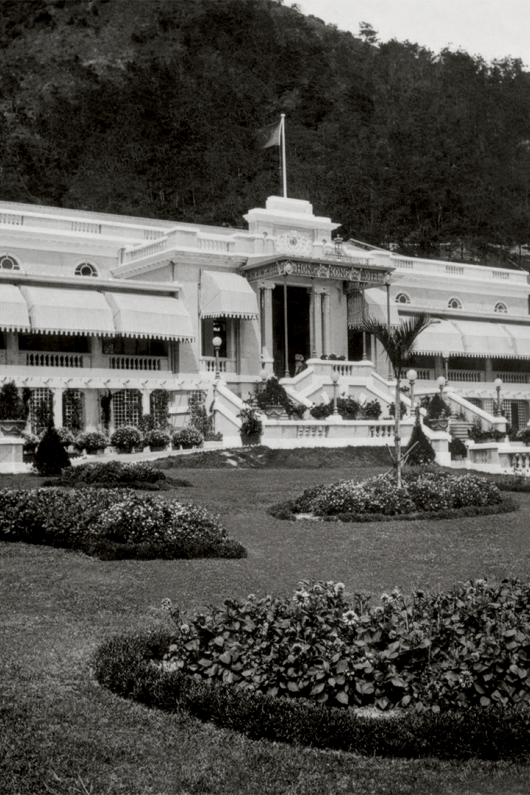
On the south side of Hong Kong Island lies the Repulse Bay Complex. The original property on the site opened in 1920 as 'The Repulse Bay Hotel', and was the place to be seen for diplomats, scholars and royalty from Hong Kong and across the globe.
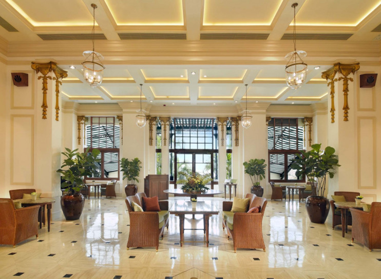
After an end-to-end redevelopment in the 1980s, the property was reopened as The Repulse Bay. The property’s landscaped gardens and expansive verandah were beautifully recreated, now complemented by luxurious apartments, new restaurants and bars, recreational facilities, and event spaces.
In 2024, The Repulse Bay leadership wanted to express their continued dedication to delivering extraordinary experiences for guests and tenants, prompting their desire to refresh this storied brand. As the long-term brand and design partner for The Peninsula Hotels, a fellow member of the Hongkong and Shanghai Hotels group, we were called on to support the effort – tapping into our deep experience and understanding of the codes of luxury that would be further embedded in The Repulse Bay’s identity.
Addressing these issues required a strategic approach that balanced tradition with new thinking, ensuring that The Repulse Bay could honour its legacy while positioning itself as a beacon of luxury and modern sophistication in Hong Kong.
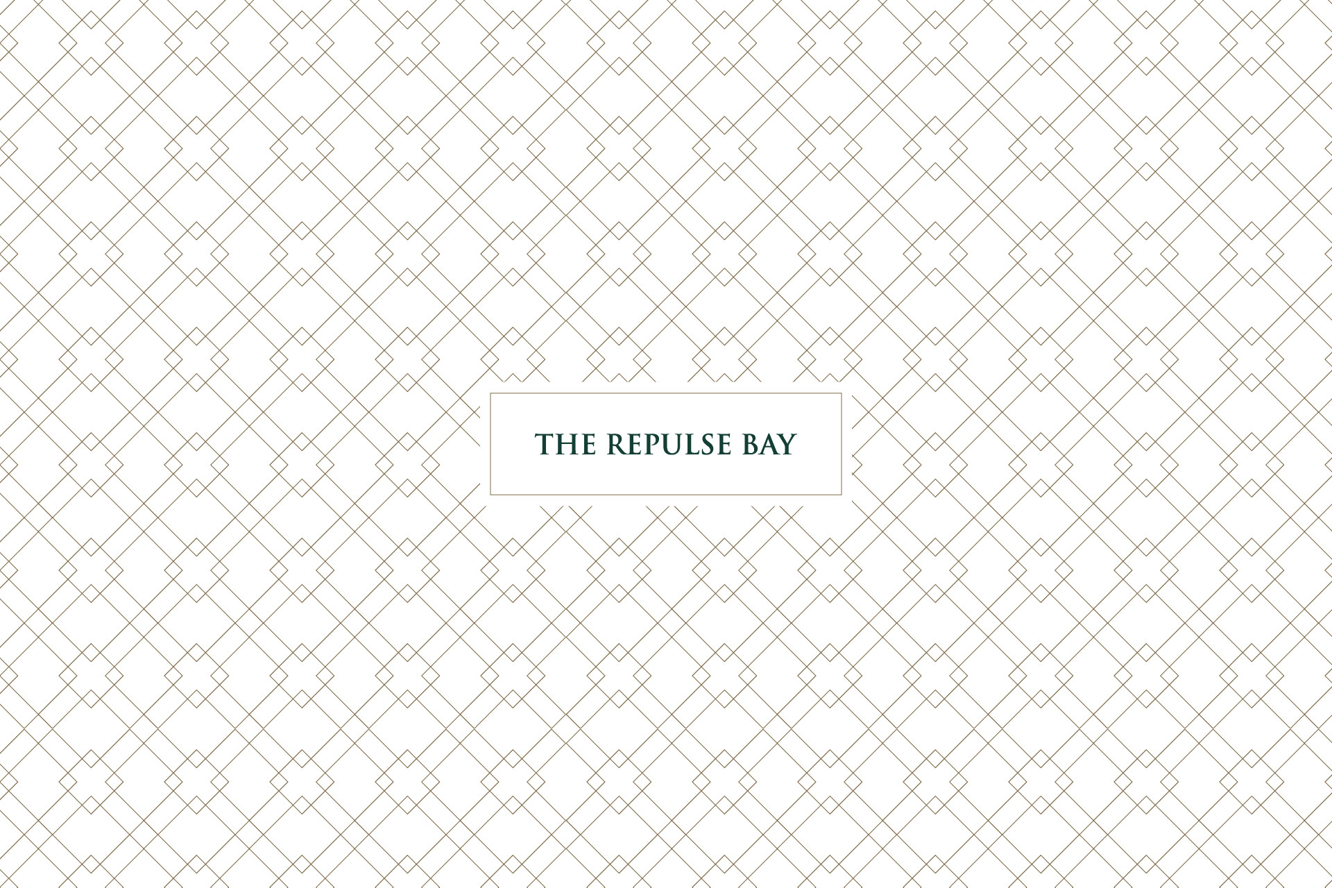
We meticulously delved into the property's rich history, pulling out symbols, themes and colours that have appeared in The Repulse Bay’s look and feel through the decades. As with every property in the HSH portfolio, The Repulse Bay holds a profound connection with its surrounding neighbourhood. We drew on this connection to craft a bespoke, visual story around a courtyard motif that can be applied across every touchpoint of the property.
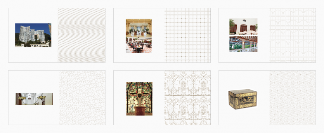
Pattern explorations
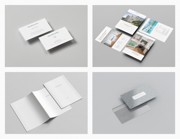
Building on the new visual foundations we had developed, we designed an extensive suite of assets and collateral that would champion the prestige of the property – from shuttle bus livery and catering food boxes, to wayfinding signage, event menus and greeting cards.
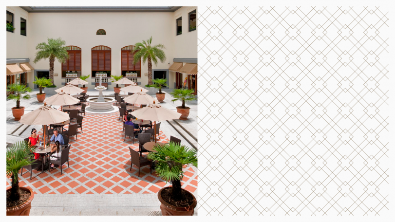
With the evolved look and feel rolling out across the property, good brand maintenance and consistency is critical. To support the on-the-ground teams, we developed a comprehensive set of brand guidelines and continue to develop new assets and touchpoints that set the standard for luxury and sophistication for the next generation of The Repulse Bay guests.
